
by Julie Terberg | Jul 31, 2024 | Article
View the PDF: Choosing Fonts for PowerPoint Voir la version francophone du PDF If you design or build PowerPoint templates, this whitepaper is for you. Share this with branding folks, decision makers, and anyone else responsible for choosing fonts for themes and...

by Julie Terberg | Jun 20, 2024 | Article
View the Updated Guide (PDF) By Julie Terberg Cloud fonts are available to Microsoft 365 subscribers on all platforms and devices. If you have Microsoft 365, you’ll see them in your font list indicated by a cloud and arrow icon. When you apply one of these fonts,...

by Julie Terberg | Apr 27, 2022 | Article
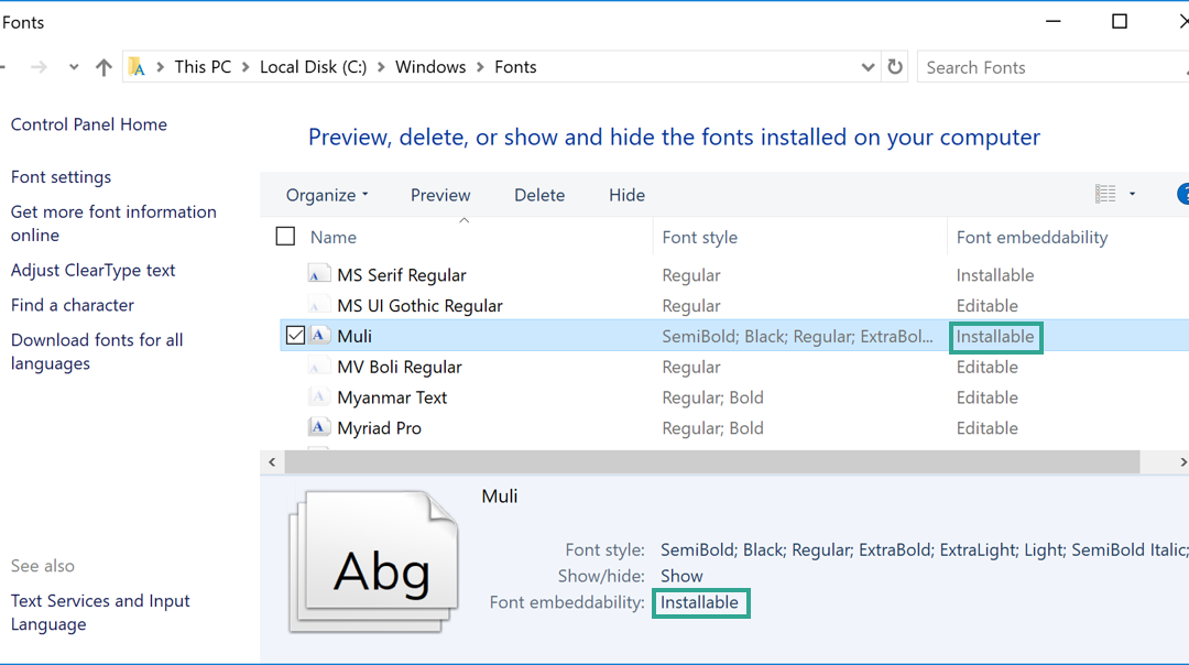
Have you ever received a PowerPoint file and the text didn’t look quite right? Perhaps the font looks like Calibri, but when text is selected the font picker shows a different font name? Or conversely, you’ve sent someone a file and they report that there are odd word...
by Julie Terberg | Sep 17, 2019 | Article
Readability and legibility are key Good typography can make or break any design effort, including presentation design. Successful presentations rely on great type to help convey information to an audience. All text displayed on screen should be legible (easy to...

by Julie Terberg | Feb 21, 2019 | Article
Echo Swinford and Julie Terberg First, we commend you for choosing to override the default PowerPoint text formatting and lose those dreaded dots from slide hell. Second, kudos to you for choosing to limit the amount of text on the screen to short, concise phrases....

by Julie Terberg | May 9, 2018 | Article
PowerPoint automatically generates the tints and shades that populate the theme color gallery. You cannot manually select your own colors for these swatches. The tints and shades are based on the values you specify for the theme colors. If your theme colors are overly...