Readability and legibility are key
Good typography can make or break any design effort, including presentation design. Successful presentations rely on great type to help convey information to an audience. All text displayed on screen should be legible (easy to distinguish letterforms) and readable (arranged for easier reading) by everyone in the audience.
Slides are for the audience, not the presenter
Presentations should be a visual aid for the audience, to support and reinforce what a presenter is saying. Slides are not a teleprompter! Presenters should never read the slides to the audience. The audience will read everything on the screen themselves—it’s human nature. And when they’re reading, they’re unable to listen to the presenter as our brains cannot process these two information channels at the same time. When striving for beautiful presentation typography, start by editing the amount of text on the slides. Include only top-level information on screen and put supporting text in speaker notes and handouts. Use brief, concise statements instead of full sentences. Guide speakers to use Presenter View when presenting, so they can see all of their notes while the audience sees your beautifully designed and edited slides.
Which fonts work best for presentations?
Legibility is the most important visual characteristic for presentation theme fonts. You’ll want to choose fonts that are simple in design and form so that the letterforms are distinguishable at smaller sizes (consider chart labels or table figures). Sans serif fonts typically fit this description and are preferred for body text. Use True Type or Open Type file formats with PowerPoint. When choosing a presentation body font, look for fonts that have lining figures—those with uniform height and alignment. Lining figures are preferable for data labels and table figures. Non-lining figures (old-style) have varying character heights, making them more visually disruptive when used for a lot of numerals. Another thing to consider when choosing a custom font is the embeddability setting. More information on that further down.  Which fonts should be avoided?
It’s best to stay away from fonts that have very thin strokes, as character legibility degrades at smaller sizes. Highly decorative or display fonts have more personality, and as such, they can be too distracting for presentation body text and figures. If you’re using PowerPoint for Mac, completely avoid using dfonts. These include: Courier, Times, Monaco, Helvetica Neue, Helvetica, and Geneva. Dfont (data fork TrueType) is a special type of font format, specifically developed for Mac OS X. You can’t use this file format on any other operating system, so these fonts will be substituted, most likely with Arial or Calibri.  Check font embeddability
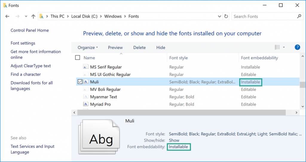
Font substitution is an ugly consequence that can—and should—be avoided. When using custom fonts, the best solution is to embed them when possible. The good news is that embedding is much improved and works well when saving a file from Office 365 (subscription-version, updated regularly) or PowerPoint 2019 (standalone version). Note: with PowerPoint 2019 for Mac, you must have version 16.17 or later. If you are considering embedding a font, it’s best to check that property setting early on in the font selection process. Not all TrueType or Open Type fonts can be embedded. Font creators can set different options for their fonts, including Restricted license, Print and Preview, Editable, and Installable. The embeddability property must be Editable or Installable in order for that font to properly embed. To see the level of embeddability for your installed font, go to Control Panel in Windows and click Fonts. Select a font to view properties at the bottom of the window, including Font embeddability.
 How to embed fonts in PowerPoint Windows (All Office versions)
- With a presentation file open, select File, Options and choose the Save tab.
- Under Preserve fidelity when sharing this presentation, select Embed fonts in the file and Embed all characters (best for editing by other people).
 MacOS (Office 365 subscribers and PowerPoint 2019 for Mac, version 16.17 or later)
- With a presentation file open, from the PowerPoint menu, select Preferences.
- In the dialog box, under Output and Sharing, select Save.
- Under Font Embedding, select Embed fonts in the file and Embed all characters (best for editing by other people).
 Font choices depend on how the presentation will be shared
Yes, you can go beyond using boring Arial or Calibri! Your font choices depend on how you will share a presentation. Consider the following scenarios to help you determine which fonts to choose from.
Scenario 1: Your presentation, your system
If you are designing and constructing a presentation (or template) on your own system, and that system will be used to display the slide show (via projection or screen share), or you will print, export as PDF, or output to video, choose any fonts you like. This includes fonts you have installed (free or licensed) that are available in your PowerPoint font gallery. There are thousands of beautiful fonts available for designers. When you’re creating a bespoke presentation and have full control over the file and delivery, then the sky’s the limit when it comes to fonts. You don’t need to be concerned with embeddability, but don’t forget legibility and readability. Note: this does not include a presentation that you will send to someone else or display using another system.
Scenario 2: Small group with similar systems
In this scenario, you are creating a presentation (or template) that will be shared and edited among a small group of people who have a similar computer setup (same OS, same Office version) and have the same fonts installed. Choose fonts available to everyone in the small group. This includes free fonts (Google fonts work well) or licensed fonts. If using a licensed font, all users must have a licensed copy, including vendors. If you have Office 365, consider using Microsoft Cloud fonts (see next page for information).
Scenario 3: Larger group, variety of systems
If you’re creating presentations that will be shared well beyond your desktop and you want to send editable PPTX (or PPSX) files, your font choices are more limited. You can either stick with fonts that are common to most systems and older versions of Office* or use embeddable fonts and take the chance that recipients won’t be using older versions of PowerPoint for Mac (prior to version 16.17). Most older versions of Windows PowerPoint will recognize embedded fonts, however older versions of Mac PowerPoint will not. If you can, test your files and embedded fonts on various systems with different versions of PowerPoint before making final choices. If you choose to use fonts that cannot be embedded, select not to embed fonts, or are unsure of the recipient’s Office version, export files as PDF to share outside the group without risk of font substitution. To preserve animations, export as a video. Do not expect clients to install a font to view your files. *List of common fonts and more information
Microsoft Cloud fonts
Cloud fonts are provided by Microsoft and hosted in the cloud. This is a font service available to Office 365 subscribers on all platforms and devices. If you have Office 365, these fonts will appear in the font gallery accompanied by a cloud and arrow icon.

When you select a Cloud font, PowerPoint downloads it in the background and applies it to your text. When someone else views the file with Office 365, or 2019, PowerPoint downloads any missing fonts from the font service and the file renders the same as it was authored, without embedding. The same is true when the file is opened with the PowerPoint mobile app (Android or iOS) or PowerPoint Online. I’ve compiled a comprehensive guide to help you wade through the list of available cloud fonts. Template designers: the guide includes a legend to help you make decisions for theme body fonts. View the PDF and more information  How to adjust paragraph and line spacing
Beautiful presentation text is easily readable. Some simple spacing adjustments in PowerPoint can help improve readability.
- Select the slide text that you want to change.
- On the Home tab, from the Paragraph group, click the dialog launcher.
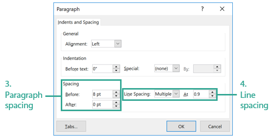
 3.In the Paragraph dialog box, under Spacing, change the amount of spacing above or below a paragraph. Type or click the arrows next to Before and After. Add sufficient spacing to distinguish separate statements or paragraphs on your slides, but not so much that it creates huge gaps. Different font sizes and font characteristics will require more or less paragraph spacing. Start with at least 6 or 8 pt (Before or After) and increase for larger sizes of text.
4. Change the options for Line Spacing to increase or decrease the amount of space within a paragraph. Click the drop down arrow to change the setting options: Single, 1.5 lines, Double, Exactly, and Multiple. To decrease spacing, choose Multiple and change the value in the At box. A setting of 0.9 is equivalent to 90% of the font size.

How to adjust character spacing (tracking and kerning in PowerPoint)
Yes, you can track and kern characters in PowerPoint by making adjustments with Character Spacing. To adjust tracking, select the text box you want to edit, and
- On the Home tab, in the Font group, select the Character Spacing button, and then More Spacing.
- Click the drop down arrow to choose Expanded or Condensed spacing.
- Define how much spacing you want by using the arrows or by directly typing in a number.
To adjust kerning, select an individual character in a text box, and
- On the Home tab, in the Font group, select the Character Spacing button, and then More Spacing.
- Click the drop down arrow to choose Condensed spacing for tighter kerning (or choose Expanded for looser kerning).
- Define how much spacing you want by using the arrows or by directly typing in a number.
NOTE: When kerning individual characters, spacing changes will be applied to the space directly following that character (to the right). 

